
Rello
Rello turns a fragmented property transaction into one clear chain everyone can follow, from quote to exchange.
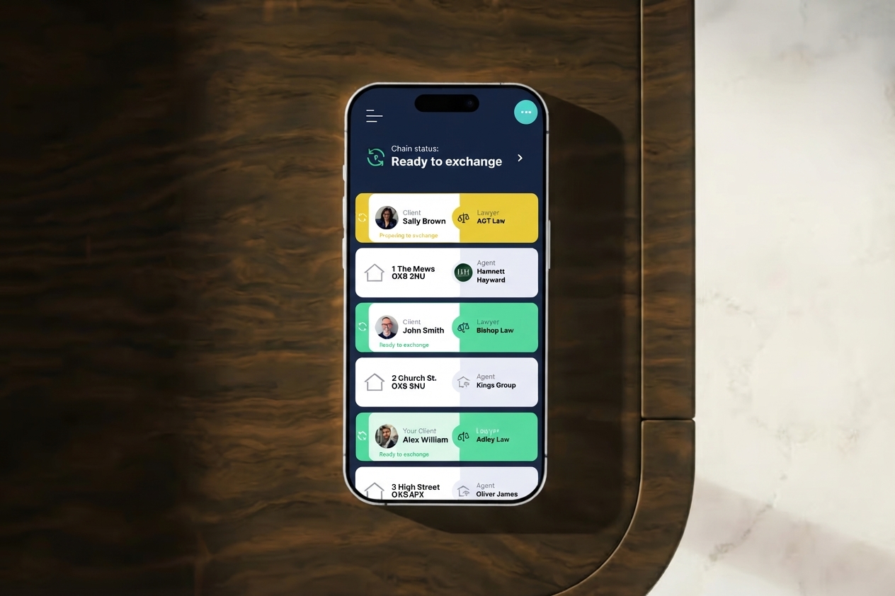
Buying or selling a home runs across many steps, documents and parties. Existing platforms lacked structure, so the process was hard to follow and easy to abandon.
Designed the product UX and UI as part of the Rhapsody team, from journey mapping to the app, desktop dashboard and marketing site.
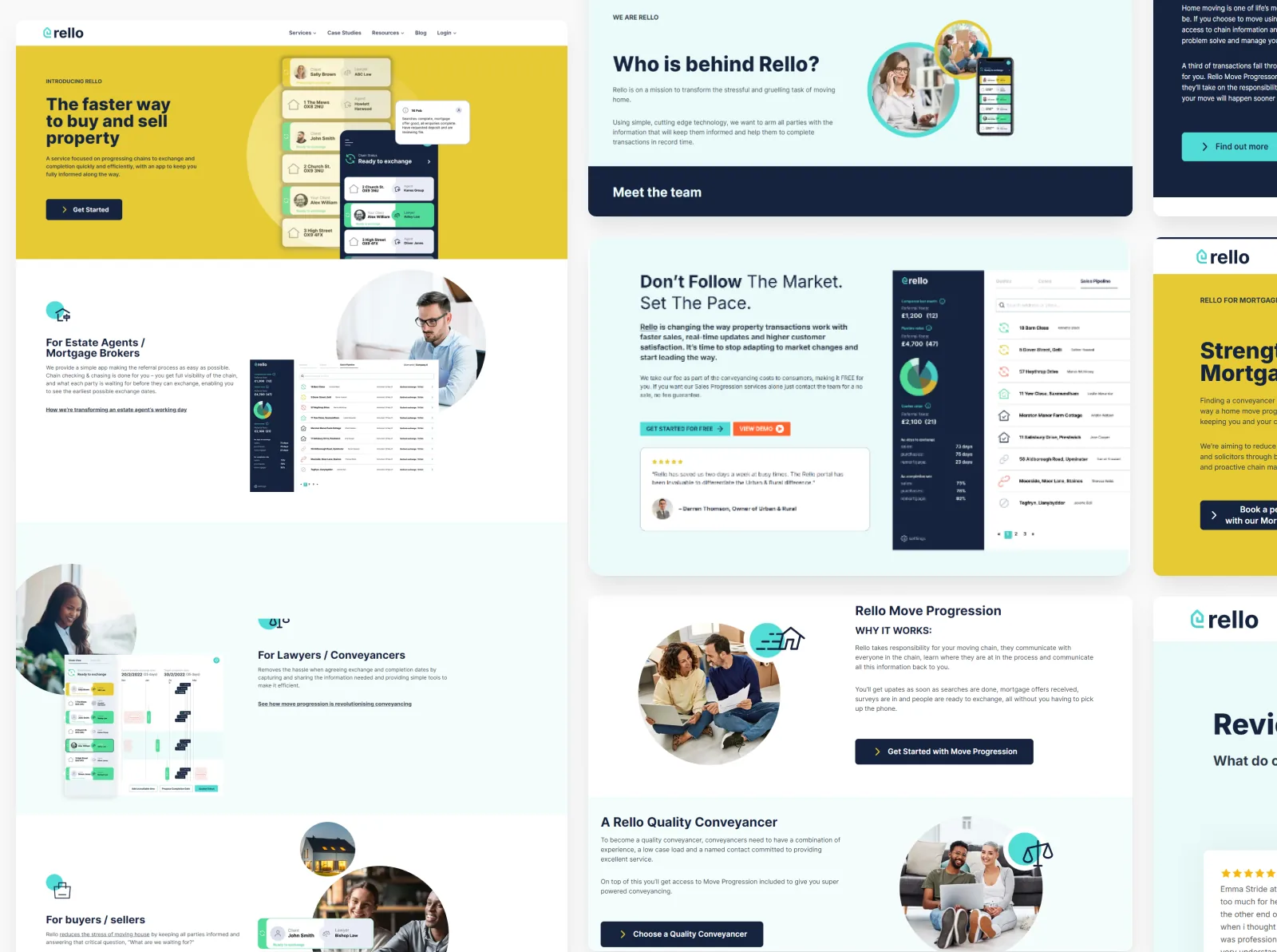
One visual language and component system across app, web and marketing, built around a single shared chain view.
A property chain is only as clear as its least informed party.
Every sale involves clients, estate agents and lawyers, each holding one piece of the picture. Updates were scattered, and clients had to switch between web and app experiences that didn’t look or behave the same. Each step came with its own anxiety, and not knowing where things stood made it worse.
Start from the service, then the screens.
I started with the business model and the service flow, then mapped the key journeys for each party to find where confusion was most likely. From there I explored several layout and hierarchy directions before choosing the one that balanced information density with visual clarity.
- QuoteClient gets and compares quotes
- PipelineAgents track every sale in one place
- Chain statusEveryone sees where the chain stands
- ExchangeUpdates move the chain to completion
Three decisions shaped the product.
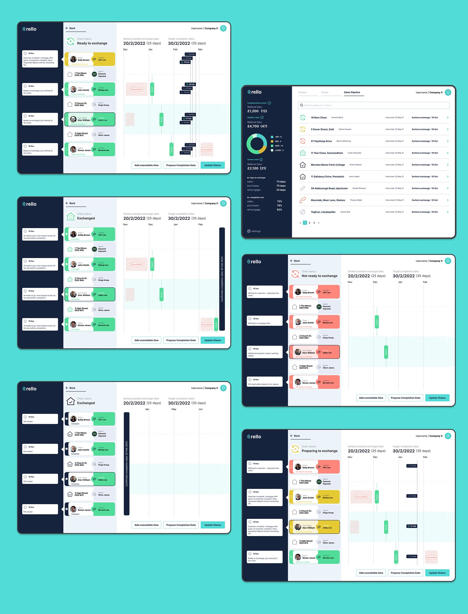
One chain view everyone can read
The chain status and its timeline became the centre of the product. Every party sees the same stages, what’s done and what’s next, instead of asking around for updates.
Why: most of the stress came from not knowing where things stood. Visible status removes the need to chase.
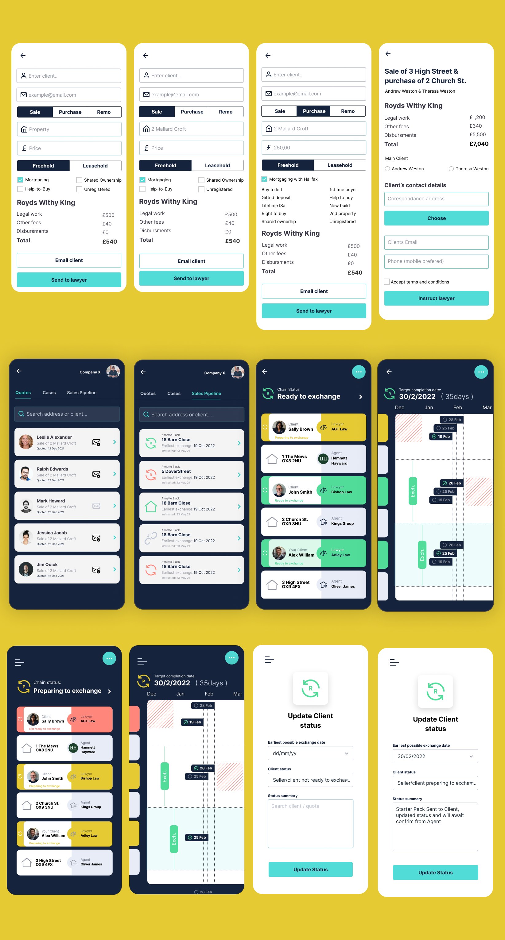
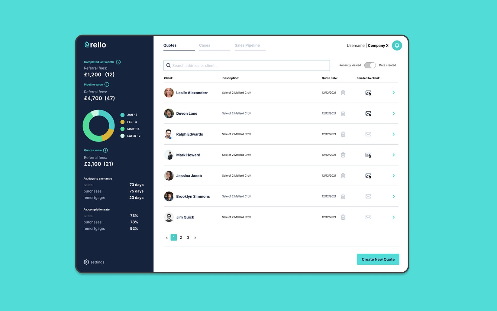
The same product on phone and desktop
One visual language across web and app, so agents working at a desk and clients checking in on their phone see the same structure and the same words.
Why: clients were confused by split platforms before. In a purchase this big, consistency is what builds trust.
A brand that earns trust, built from reusable parts
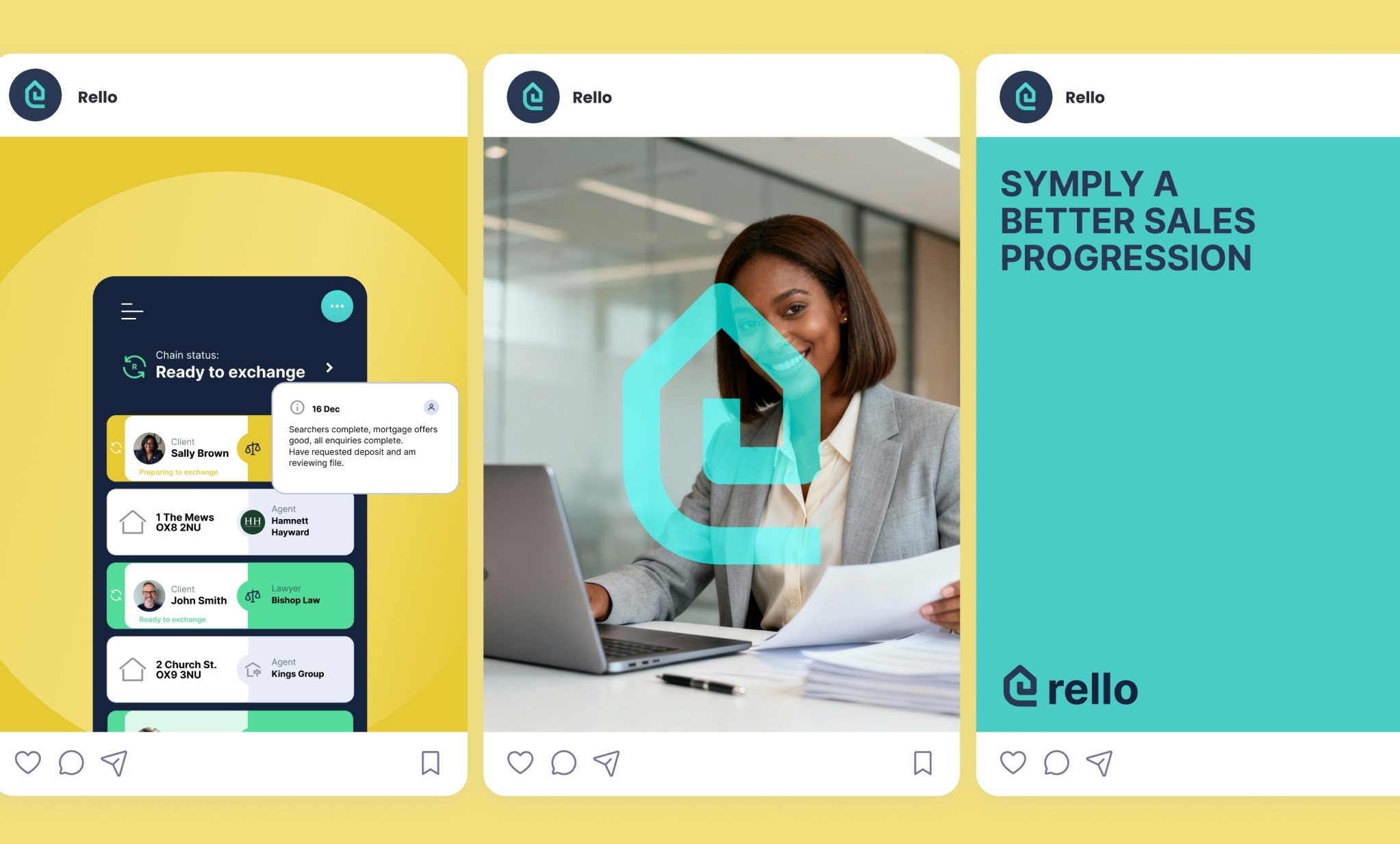
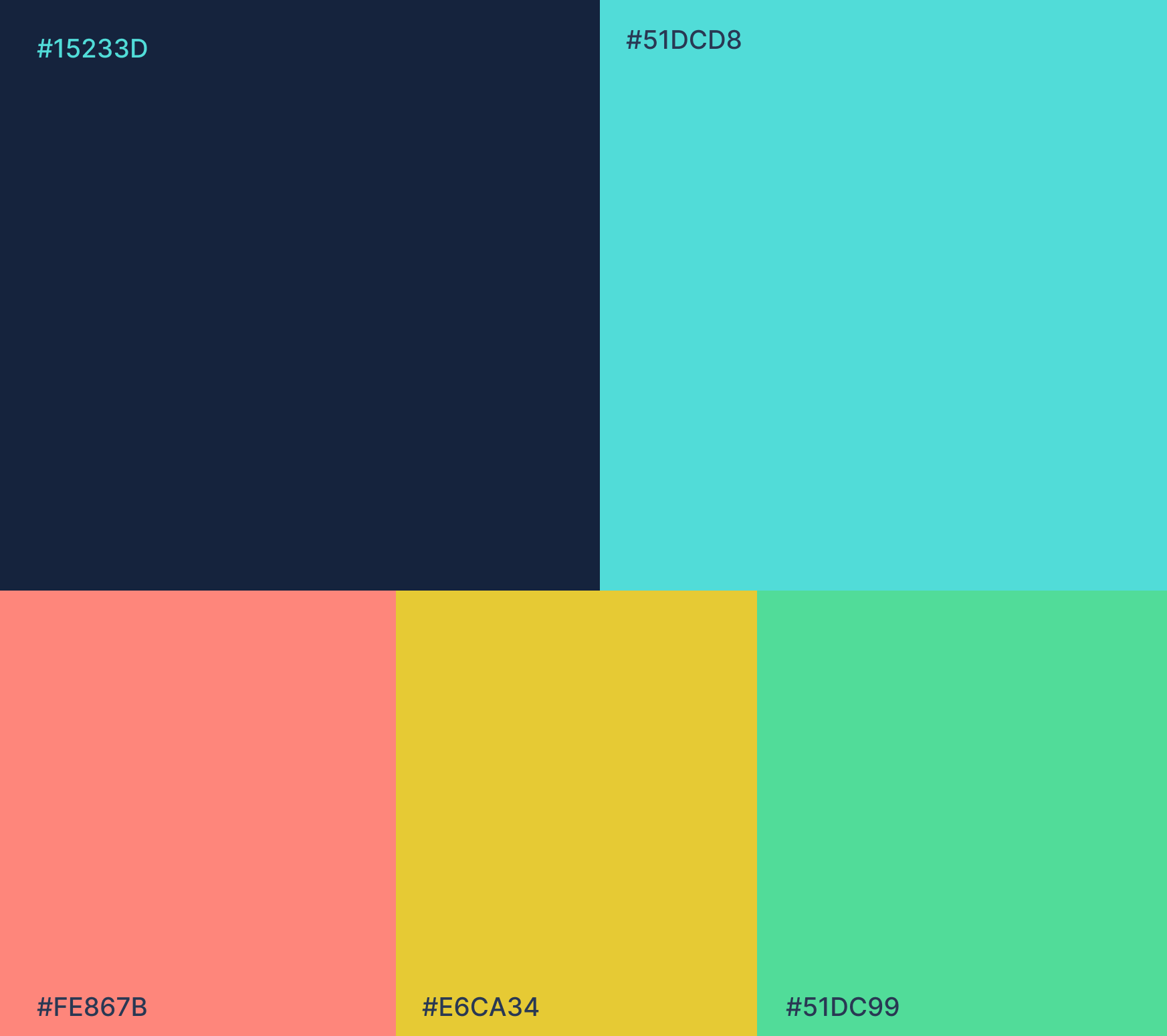
A bold palette of navy, yellow, coral and mint with clean typography positions Rello as a credible alternative to legacy real estate platforms. Components were designed for reuse at every touchpoint, from the marketing site to the deepest in-app screens.
One product, one chain, one language.
- A multi-step transaction simplified into a clear, step-by-step structure
- A single visual language across web and app, ending split-platform confusion
- Reusable components powering the marketing site, the product and social
Got a product that feels more complicated than it should?
I help teams turn messy, multi-step flows into products people understand. Let's talk about yours.