
Awaken180°
Awaken180° had an app that only covered the basics. I rebuilt it into a daily companion clients actually want to open.
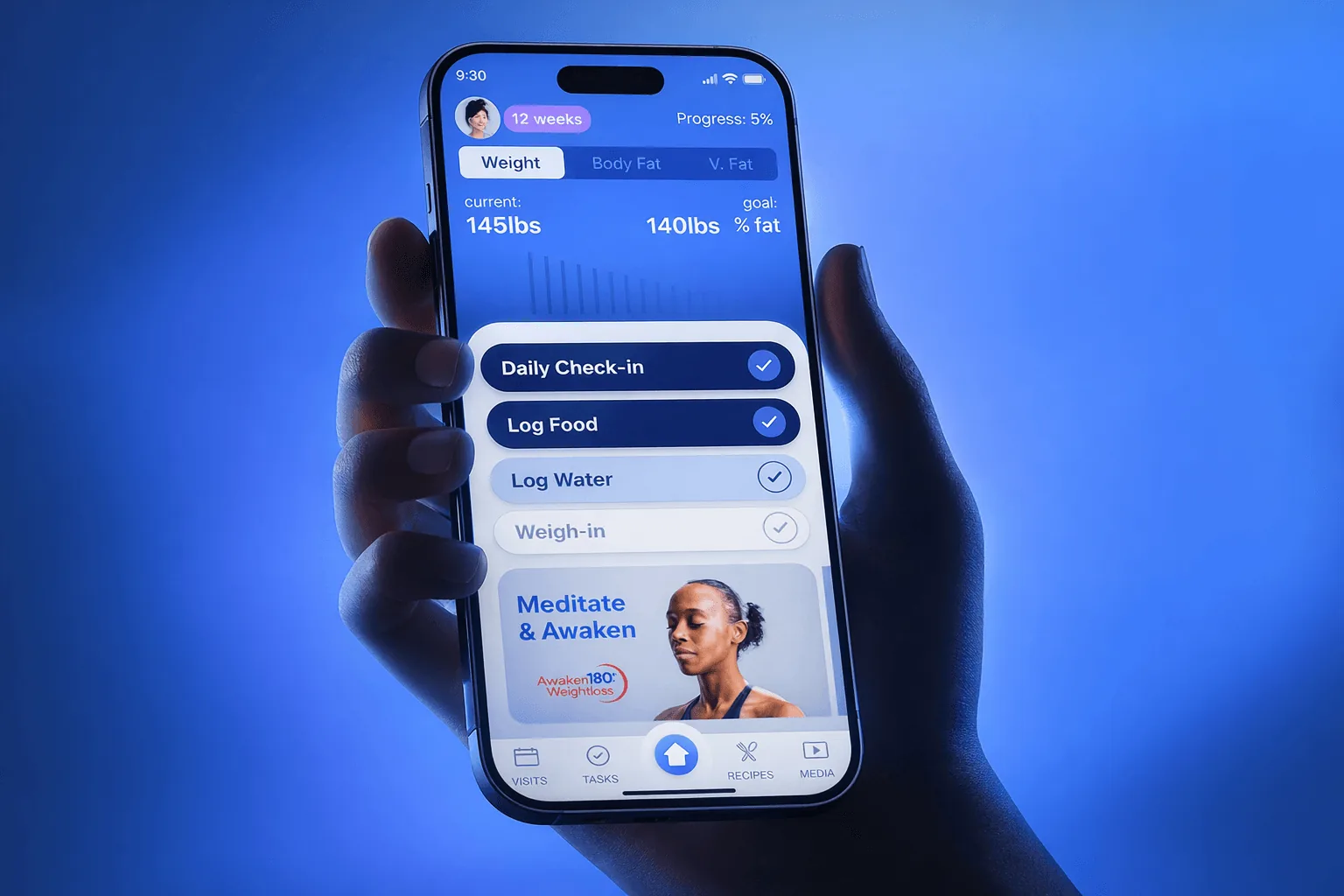
The existing app was outdated and minimal. Clients couldn’t track progress, log meals or stay engaged between in-person coaching sessions.
Led UX and UI end to end: journey mapping, information architecture, new features and the full visual system.
A rebuilt app centred on a daily habit loop, with onboarding that gets clients to their first action in under 2 minutes.
The program worked in person. The app didn’t.
Awaken180° is a 12-week weight-loss program with a proven in-person method. Between sessions, though, clients were on their own: no real progress tracking, no meal logging, nothing that pulled them back day to day. That gap hurt consistency and motivation, which is exactly what the program depends on.
Rebuild the app around one daily loop.
I mapped the full client journey to pinpoint where the old app was failing: clunky onboarding, no visible progress, no reason to come back. Then I rebuilt the information architecture around a simple daily loop and expanded the feature set well beyond the original.
- Check inDaily check-in and weigh-in
- LogFood, water, sleep and mood
- Learn & moveRecipes and guided workouts
- See progressResults and milestones
Four decisions turned it into a habit.
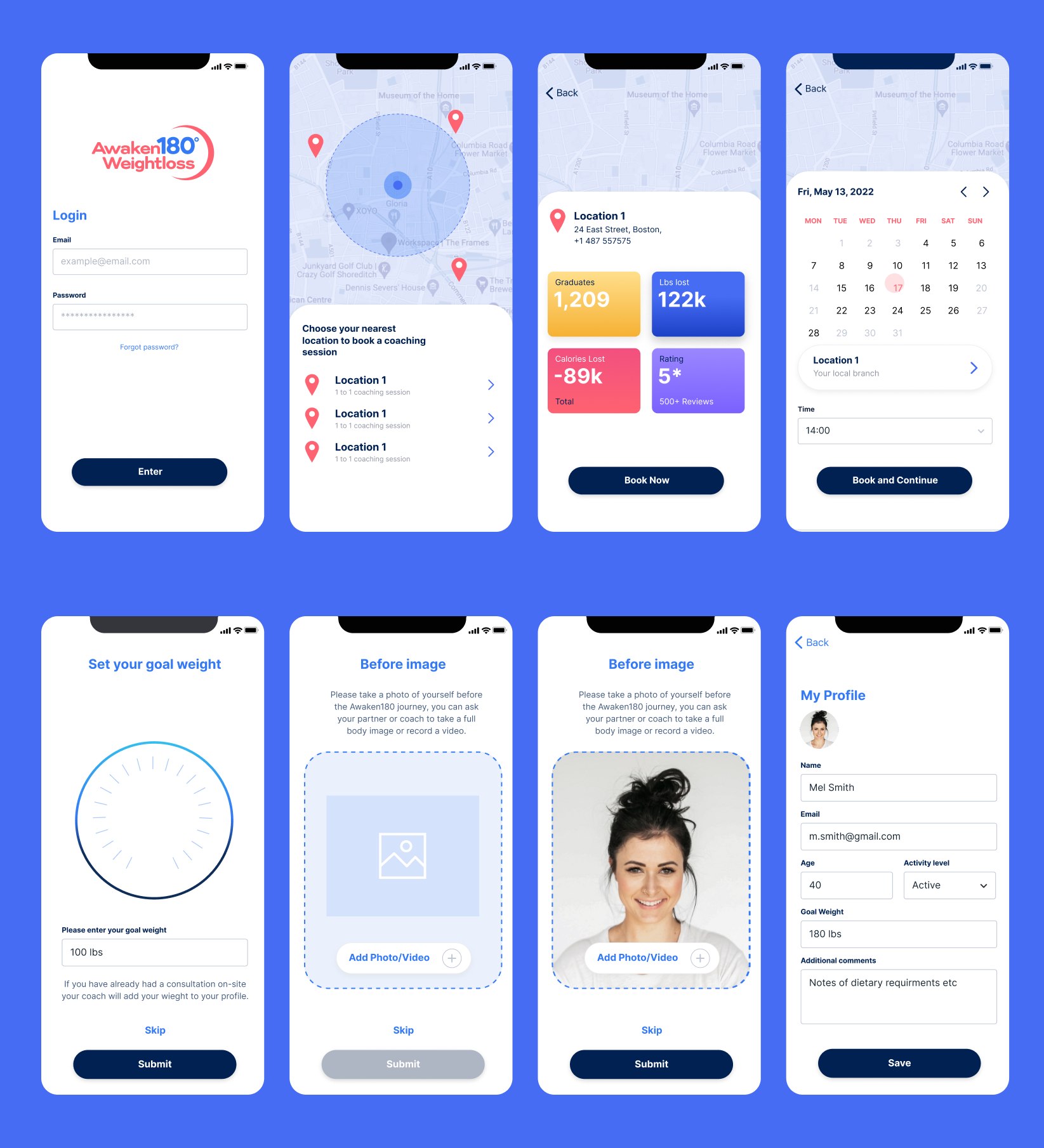
First action in under 2 minutes
Login, location, booking a coaching session, then goal, before photo and profile. Short, focused steps that get clients doing something real right away.
Why: the first session sets the habit. A long setup is exactly where motivation drops.
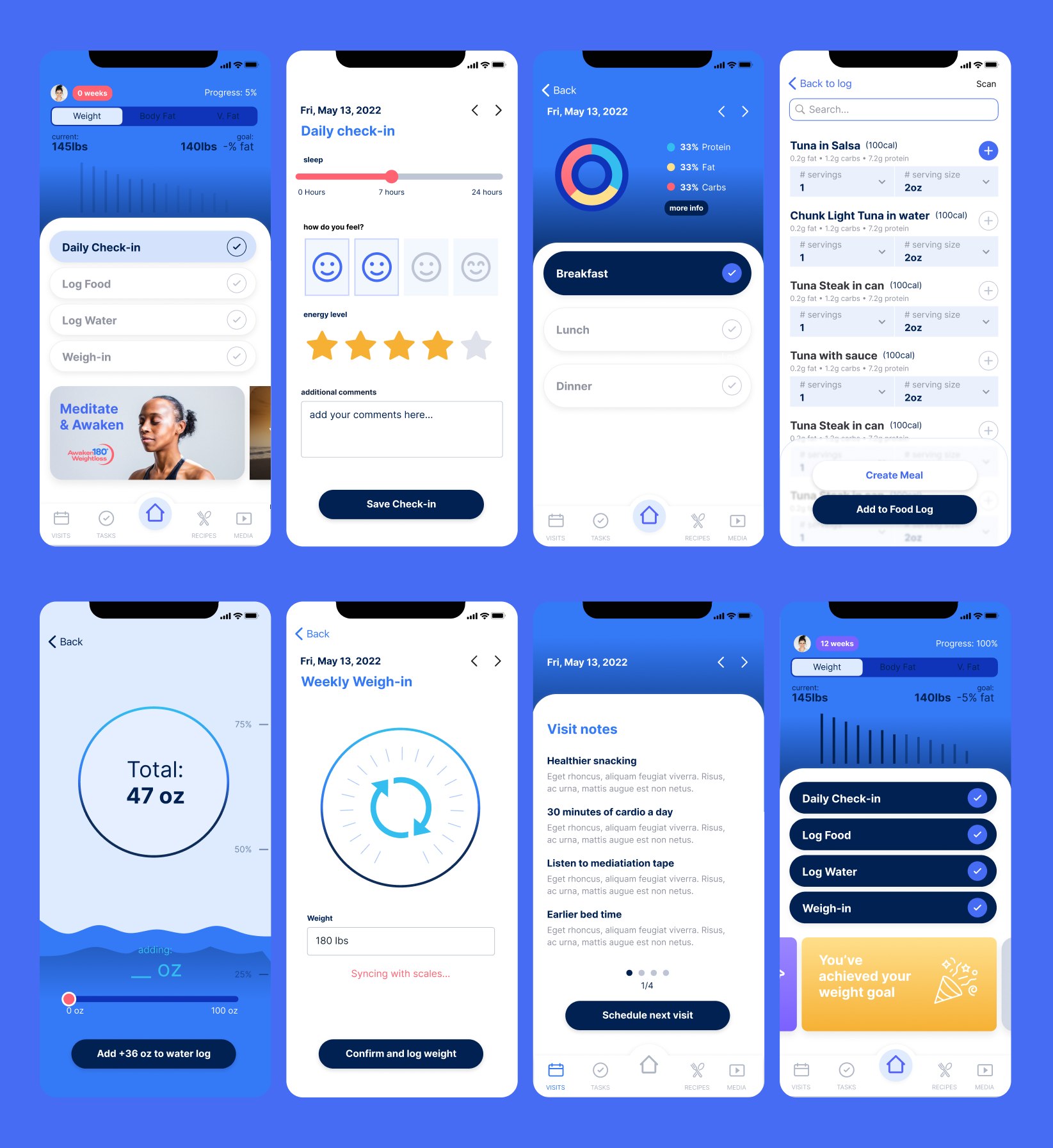
A home screen with only today’s actions
The dashboard surfaces the core daily actions: check-in, food and water logging, weigh-in and coach notes. Everything else is one tap away.
Why: a focused home keeps the daily loop fast instead of overwhelming.
Everything inside the app
Food scanning, a recipe library, water, sleep and mood tracking, and guided workout videos. None of it existed before, and clients no longer get sent elsewhere.
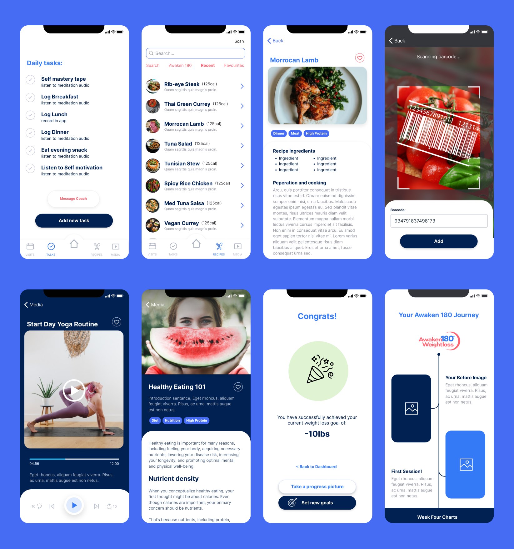
Progress you can see
A results dashboard shows the whole journey at a glance, with milestone moments designed to keep motivation up once a goal is hit.


From bare minimum to daily companion.
- Onboarding redesigned around getting to a first real action fast
- Seven new capabilities the original app never had
- A focused home screen that keeps the daily loop simple
Got a product that feels more complicated than it should?
I help teams turn messy, multi-step flows into products people understand. Let's talk about yours.