
Moke
Moke turned a niche electric car into an everyday indulgence, tripling qualified leads.
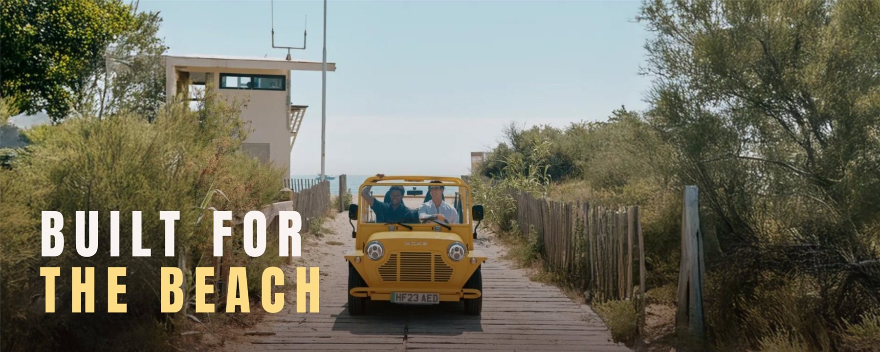
Several regional websites with inconsistent identities were diluting the premium positioning of the new Electric MOKE and putting pre-orders at risk.
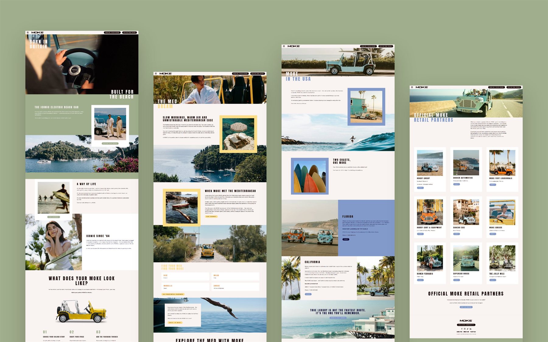
Designed the UX and UI of the new site, from the journey structure to the responsive visual system.
A unified, launch-ready site that supported campaign traffic from day one and tripled qualified leads.
A premium product with a fragmented front door.
MOKE International launched the Electric MOKE while running multiple regional websites, each with its own look. For a lifestyle product that sells on feeling, that inconsistency undercut the brand right when pre-order momentum mattered most.
Sell the feeling first, then the spec.
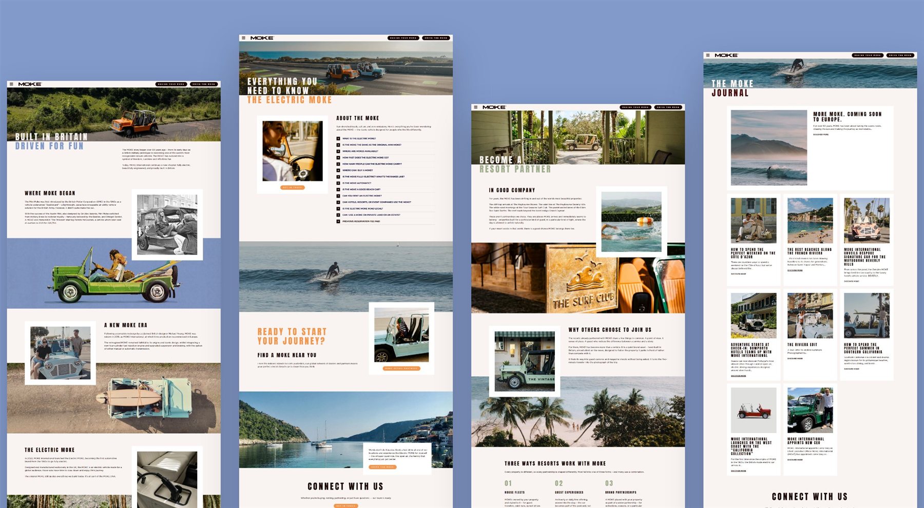
The design is rooted in the Electric MOKE’s identity: open-air freedom, coastal living, effortless exploration. An editorial palette, aspirational typography and layouts that let lifestyle photography carry the emotion before a single spec is read. Underneath, the journey runs in four steps.
- DiscoverLifestyle and brand story
- UnderstandDesign, details and specs
- ConfigureBuild your Moke
- Pre-orderLow-friction checkout
Three decisions drove the result.
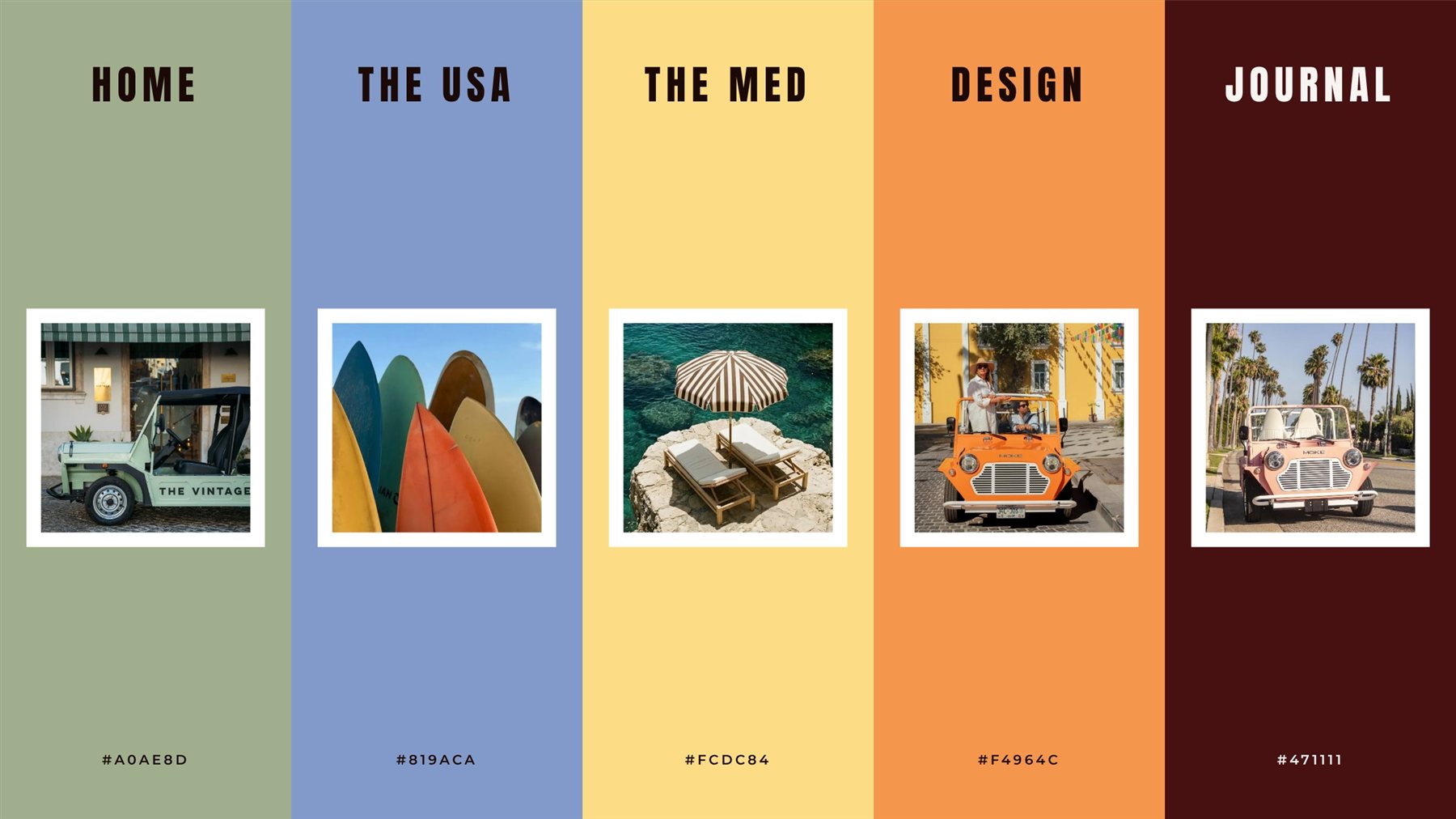
One system for every region
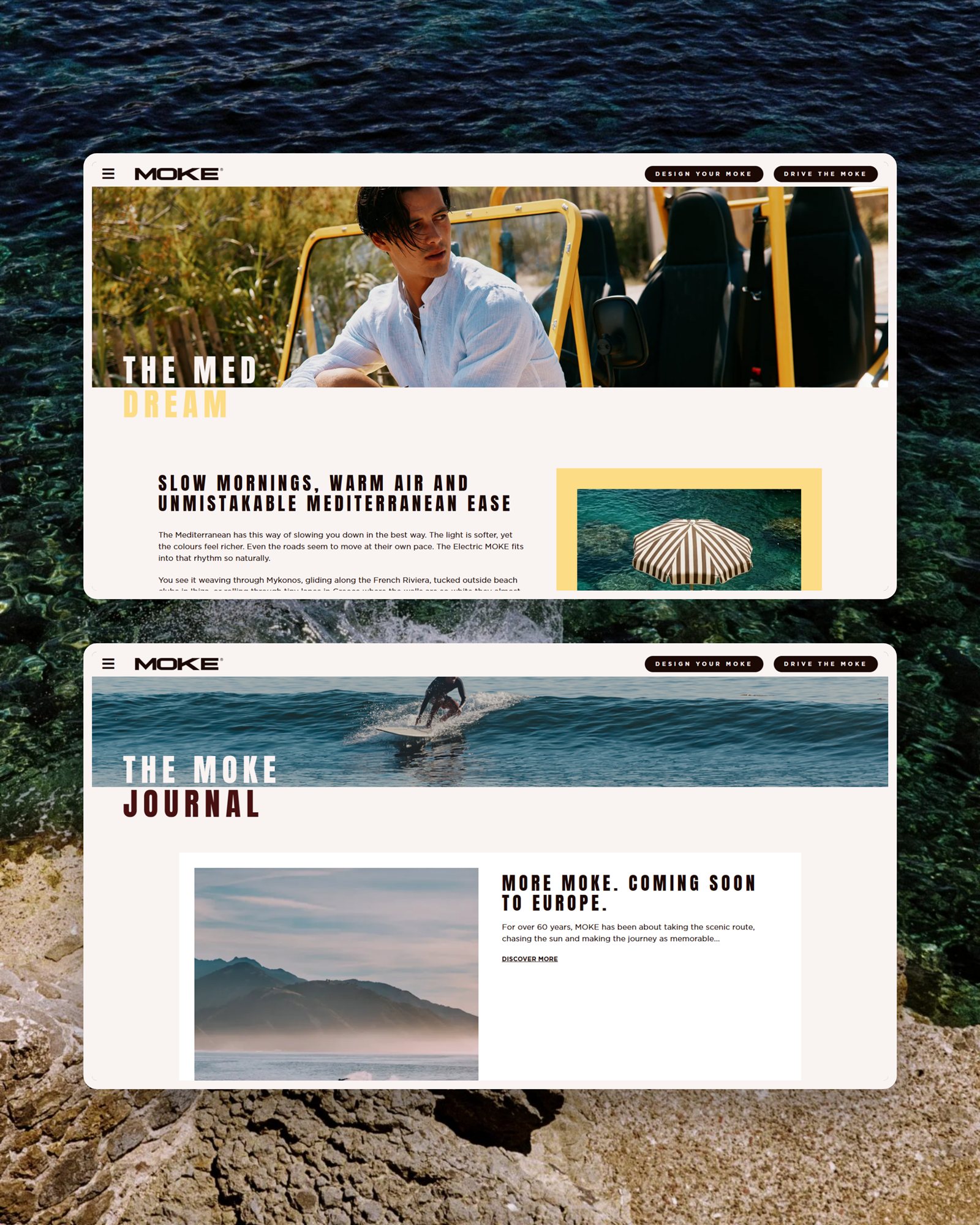
All regional touchpoints unified under one visual system, with accent colours that give each section its own character without breaking consistency.
Why: fragmentation was diluting a premium brand. One system makes every region feel like the same product.
Photography carries the emotion
Layouts built to let the lifestyle shots do the selling, so visitors feel the product before they compare it.

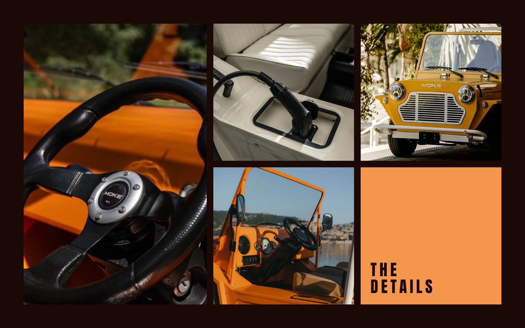
A journey that ends in a pre-order
Discover, understand, configure, pre-order. Each page moves the visitor one step closer to checkout, and the system holds up across desktop, tablet and mobile.
Launch-ready, and it converted.
- Every regional touchpoint unified under one visual system
- A journey structured to reduce friction at checkout
- Delivered in time to support campaign traffic and pre-orders from day one
Got a product that feels more complicated than it should?
I help teams turn messy, multi-step flows into products people understand. Let's talk about yours.