
Agenture
Agenture brings campaigns, deliverables, finance and social performance together into one calm, clear marketing platform.
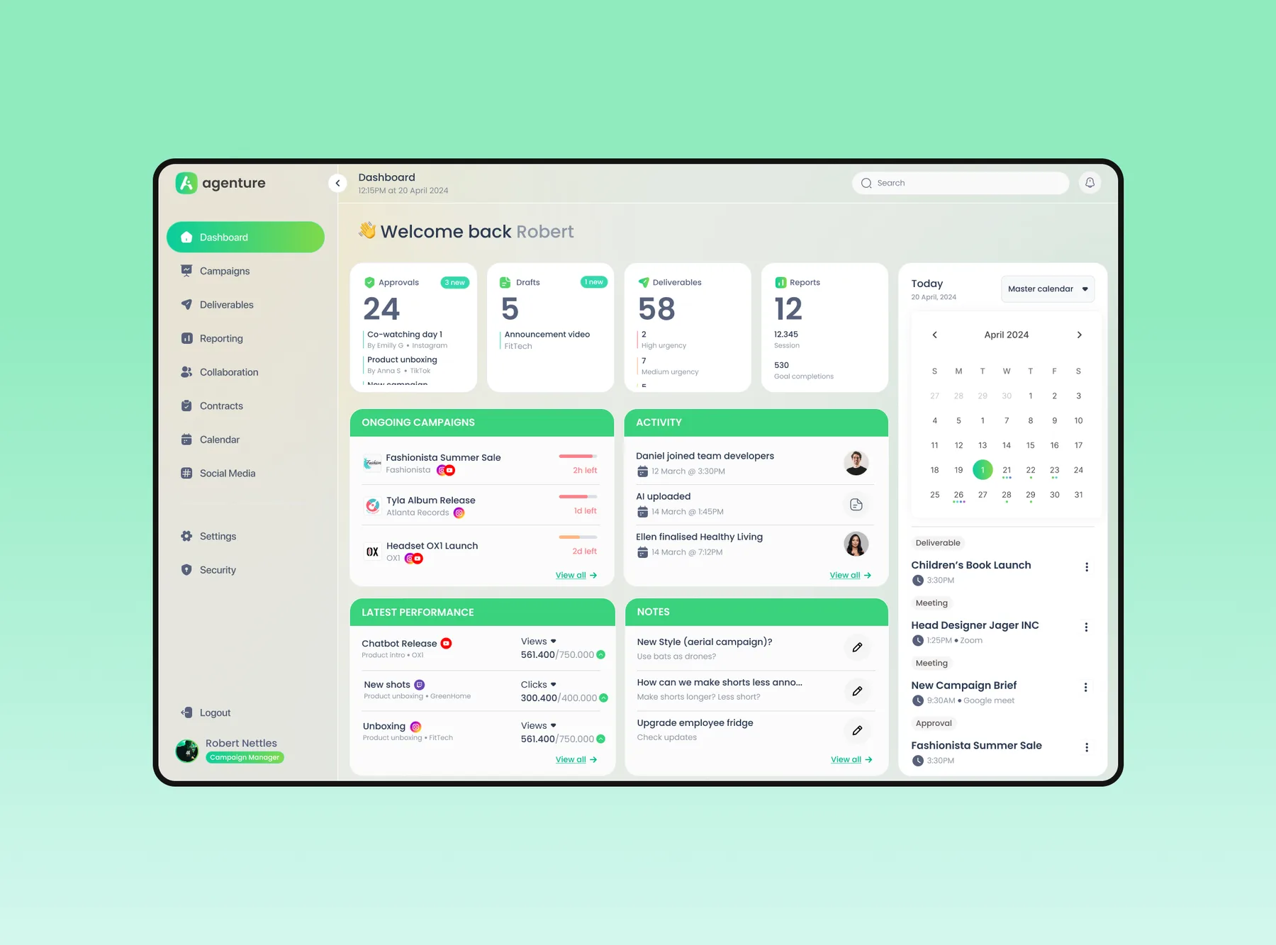
Campaign managers juggled separate tools and spreadsheets for approvals, deliverables, budgets and social performance.
Co-designed the platform with another designer, contributing key screens across the dashboard, campaigns, finance and reporting modules.
Very different modules that feel like one product, built from a shared set of components.
One place to run a campaign, without it feeling like a cockpit.
Agenture set out to replace a patchwork of tools with a single workspace. The hard part wasn’t adding features. It was keeping a dense, data-heavy product calm and easy to move through, across modules with very different jobs.
Shared patterns first, modules second.
Working alongside another designer, we kept one visual language and a shared set of interaction patterns across the dashboard, campaigns, finance and reporting views. Each module solves its own problem while still feeling like part of the same product, not a separate tool.
- DashboardWhat’s happening today
- CampaignsWhat needs attention
- FinanceBudgets, revenue and costs
- ReportingWhat’s working, against goals
Four decisions kept it calm.
One set of building blocks for every module
Stat tiles, tables, status pills and charts are reused everywhere. Learn them once, and every module reads the same way.
Why: campaign managers jump between modules all day. Familiar parts make each switch cheaper.
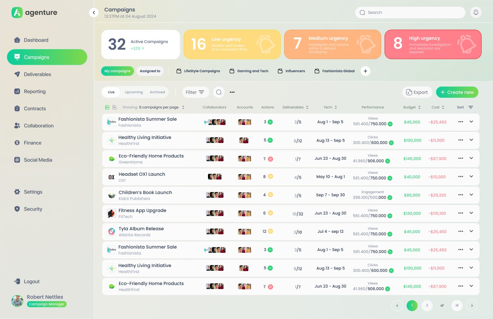
Urgency before detail
The campaign list opens with what needs attention: active campaigns, then low, medium and high urgency counts, each saying what to do next. Below that, one row per campaign holds collaborators, deliverables, term, performance against target, budget and cost, with saved views and Live / Upcoming / Archived tabs to cut the list down fast.
Why: with dozens of live campaigns, the first question isn’t “what exists?” but “what’s on fire?”.
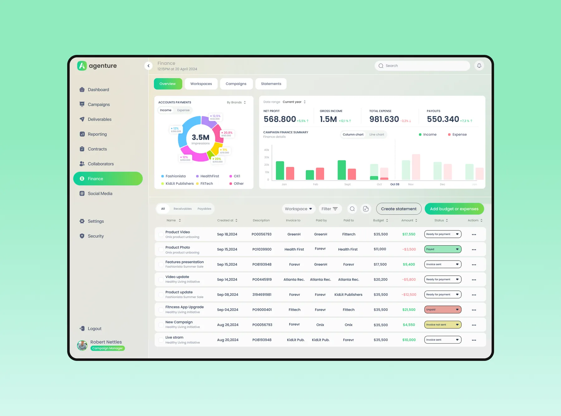
Calm density
Clear cards, generous spacing and a fixed sidebar keep complex data scannable at a glance, even on the finance screens. A warm green accent keeps it friendly rather than corporate for teams who live in it all day.
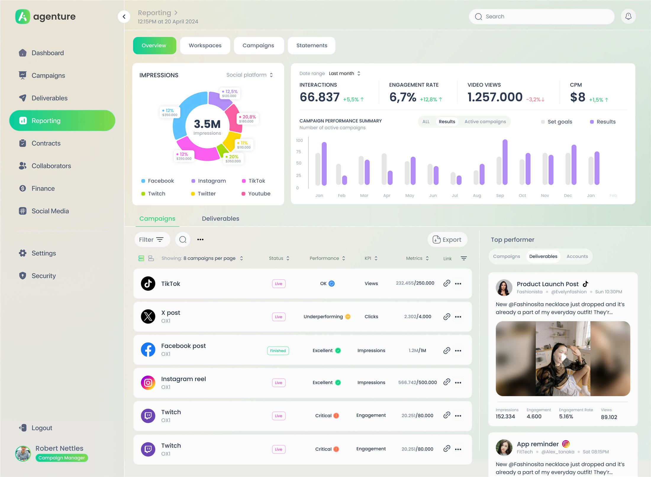
Results against goals, not just numbers
Reporting starts with four headline KPIs and their trend, then impressions by platform and results compared with set goals. Every deliverable shows its metric against its target with a plain-language status: Excellent, OK, Underperforming, Critical. Top performers sit alongside, so it’s clear what to repeat.
Why: a number on its own doesn’t tell a manager whether to act. A target and a status do.
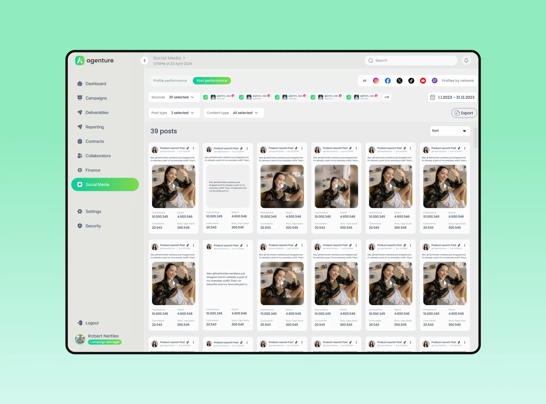
A dense platform that still feels light.
- Dashboard, campaigns, finance and reporting built on one shared component set
- Urgency and goal status surfaced first, so managers know where to act
- Consistent patterns that make moving between modules effortless

Got a product that feels more complicated than it should?
I help teams turn messy, multi-step flows into products people understand. Let's talk about yours.