The Challenge
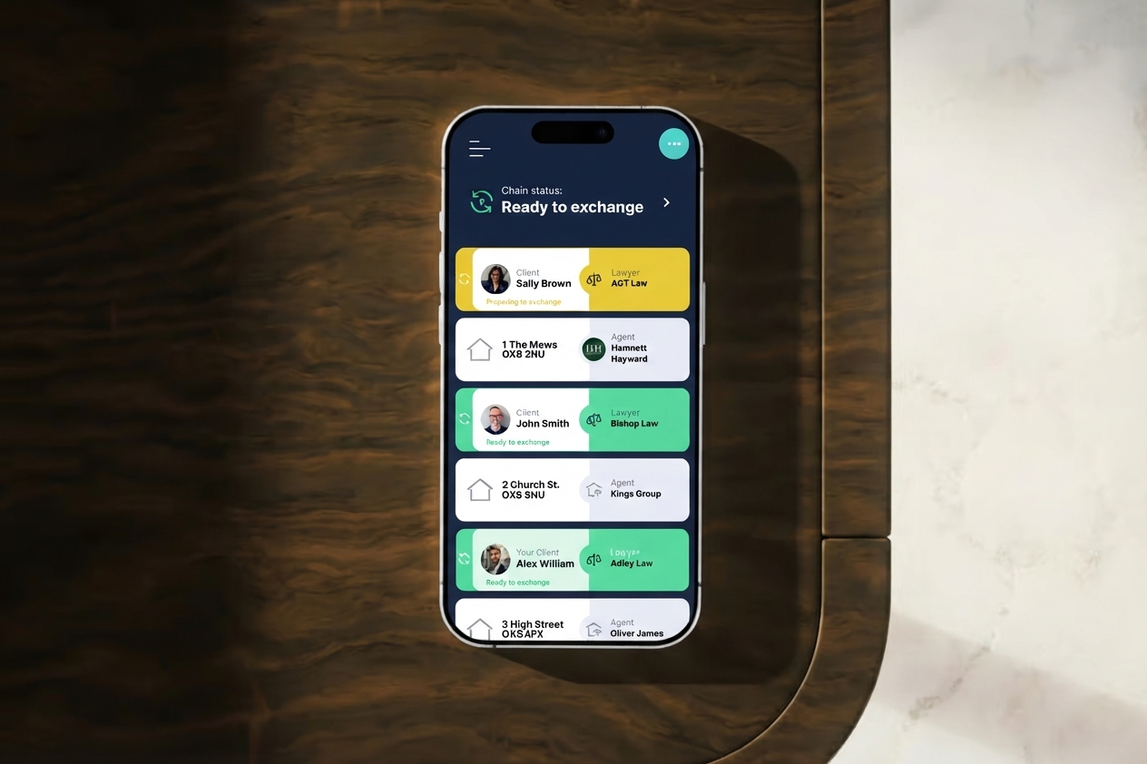
Rello needed to simplify a property buying and selling process spread across multiple steps, documents, and stakeholders. Existing platforms lacked clarity and structure, making the process hard to understand and easy to abandon.
The Approach
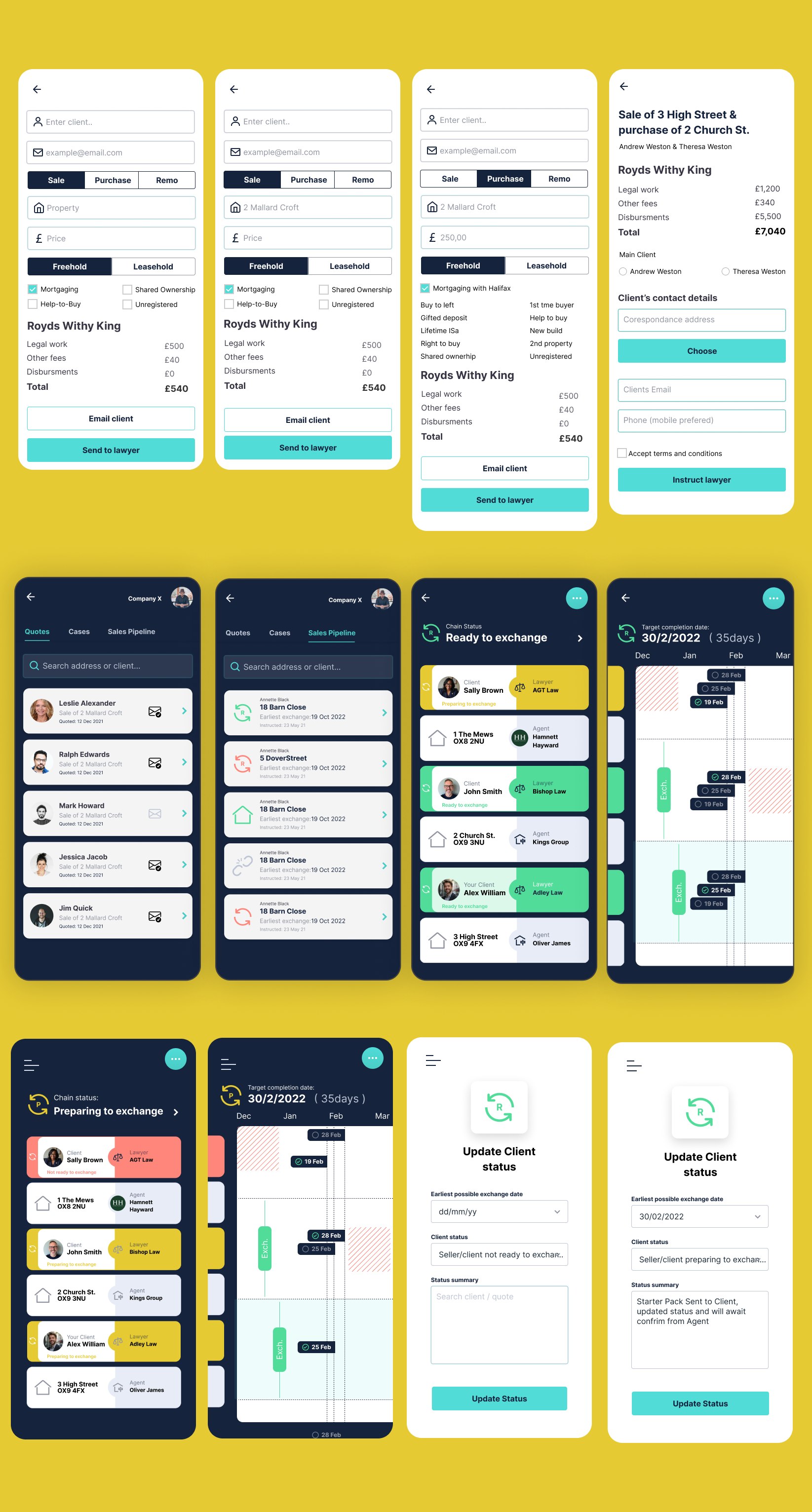
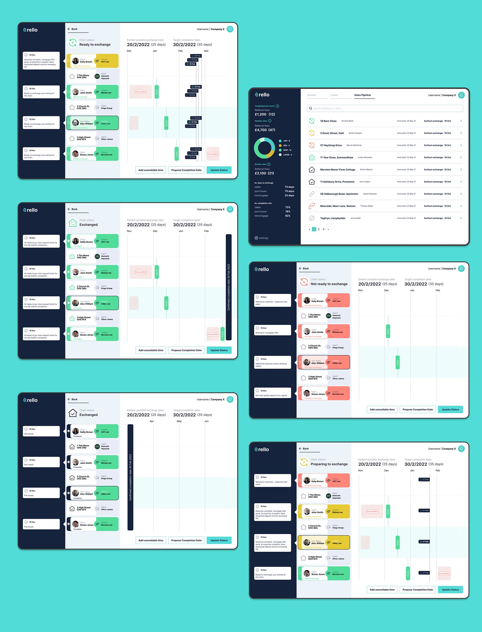
Structured the design around a deep understanding of business model, service flow, and specific anxieties users face at each step. Mapped key user journeys to identify where confusion was most likely, then explored multiple layout and hierarchy directions before settling on a structure that balanced information density with visual clarity.
Key Decisions
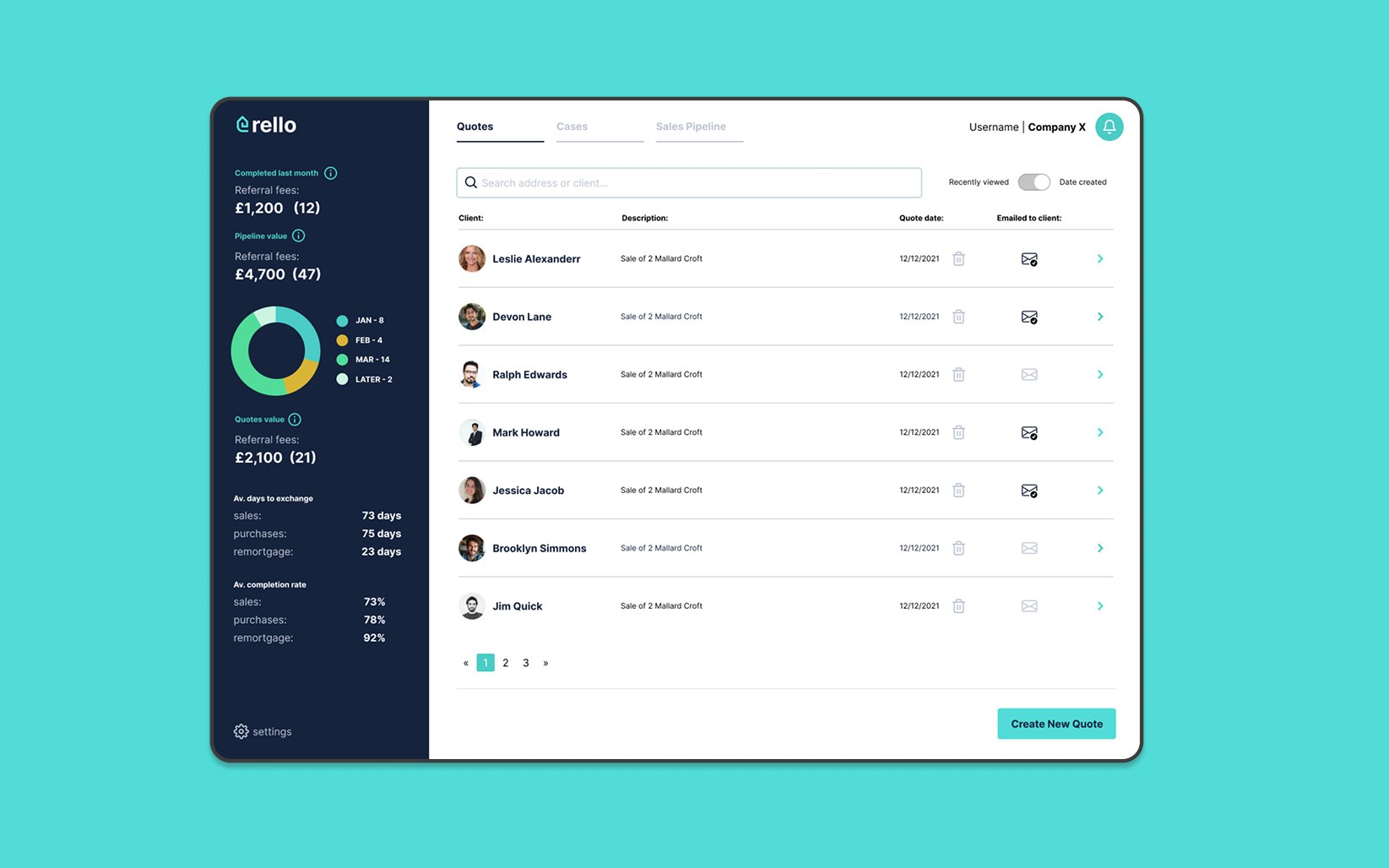
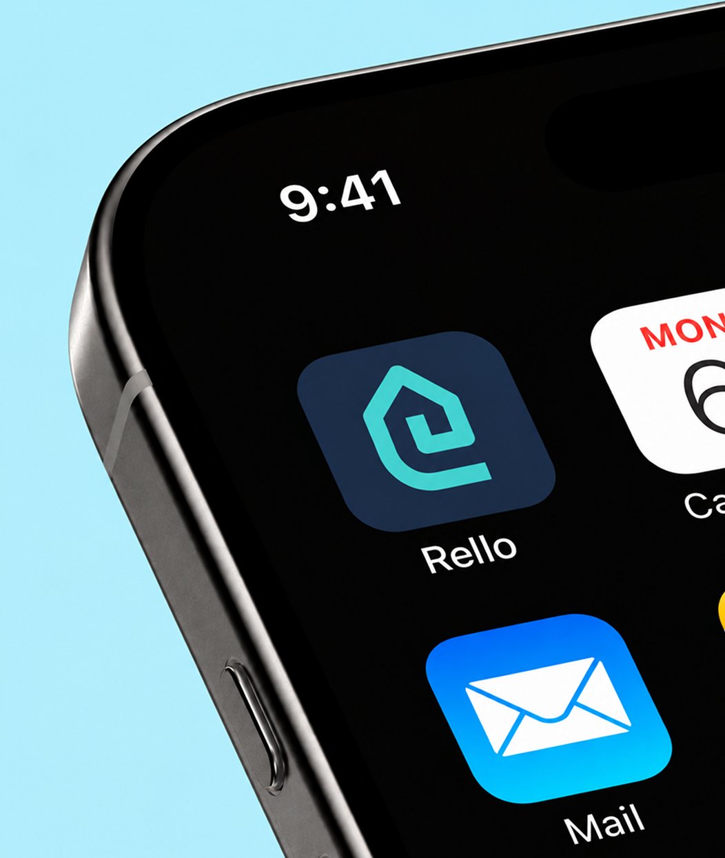
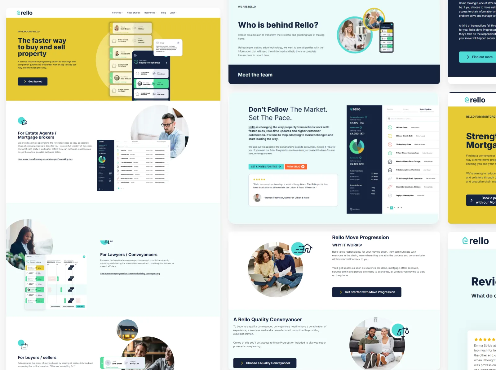
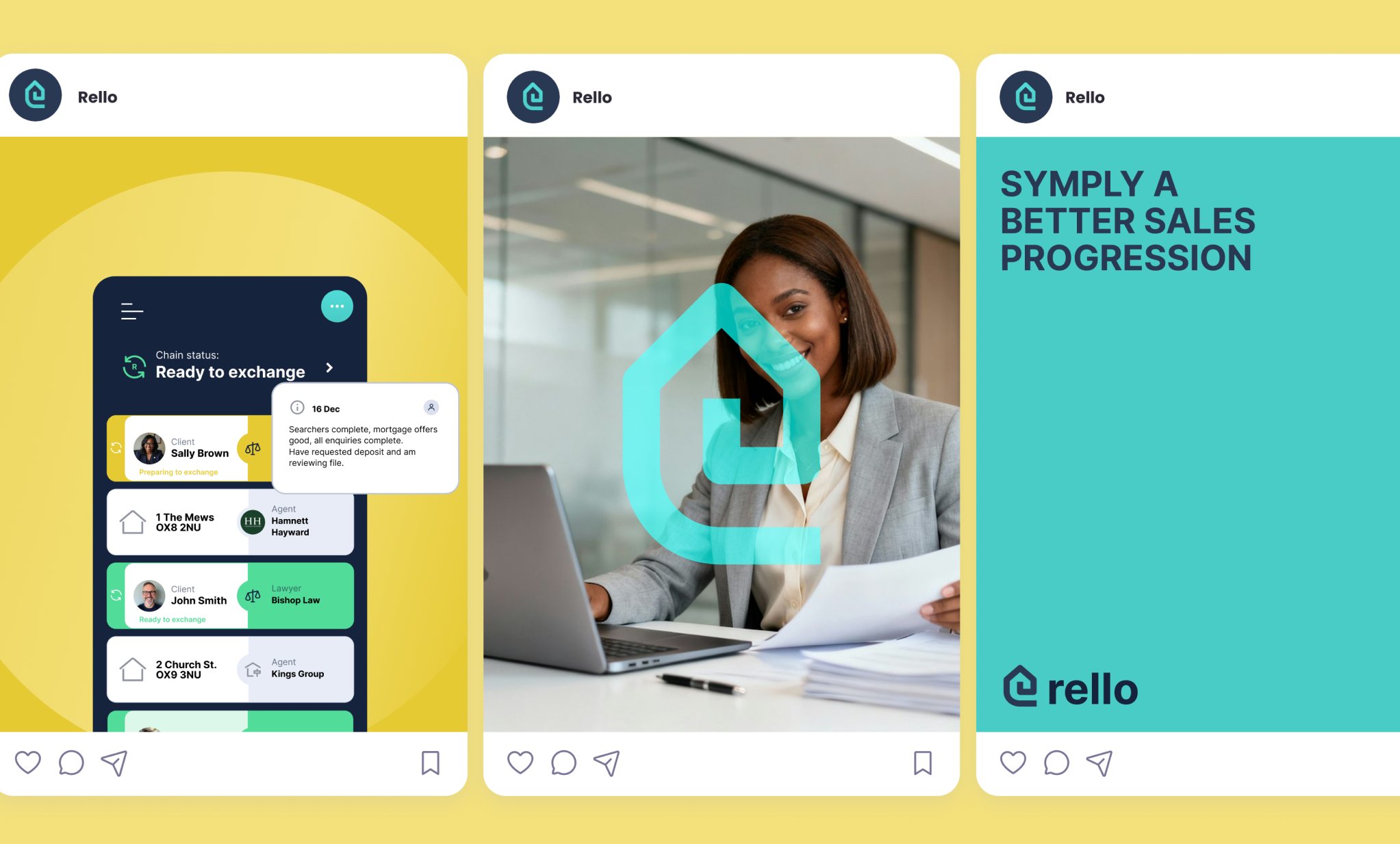
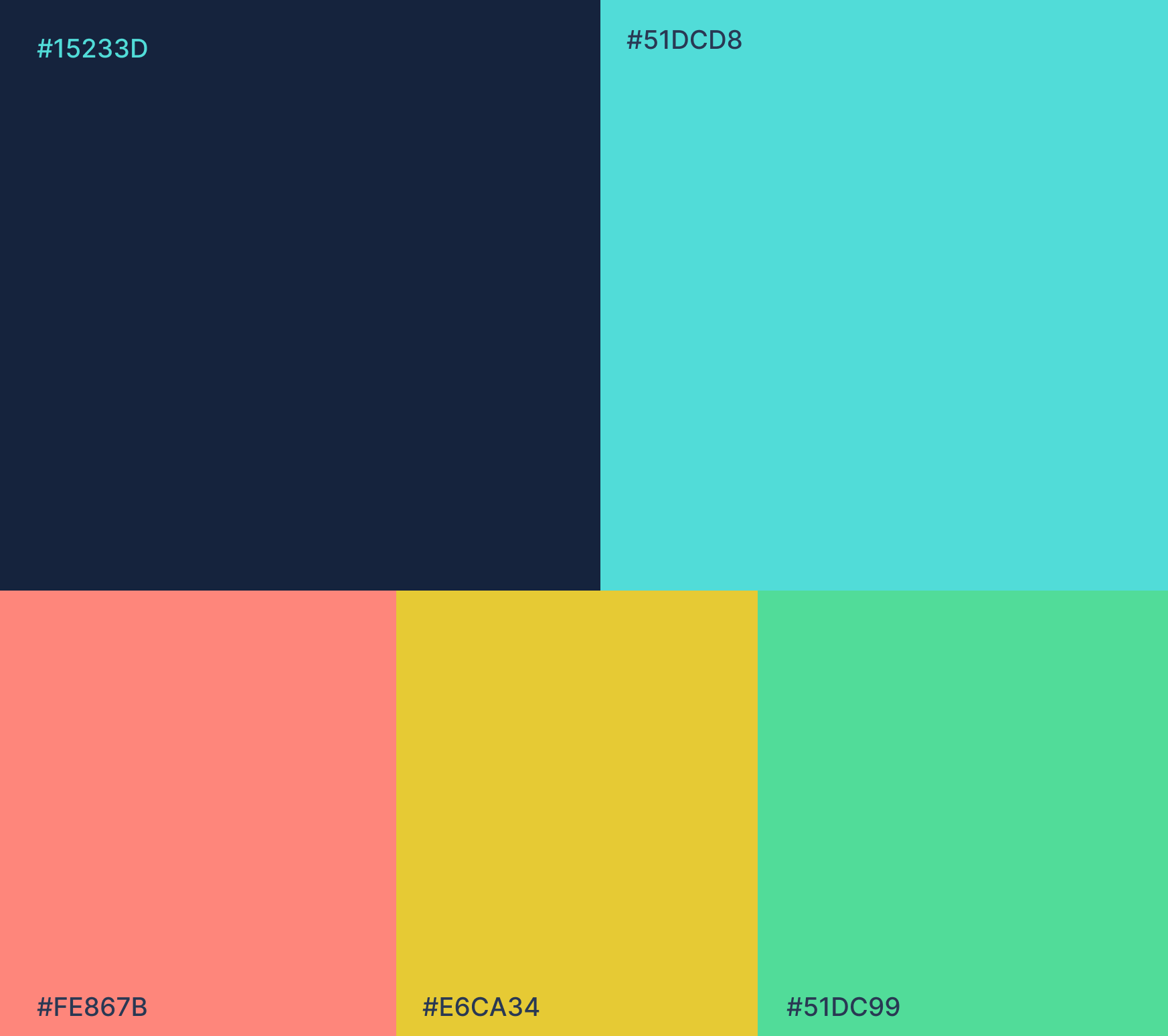
Applied a single visual language consistently across web and app, eliminating the split-platform confusion clients previously faced. Simplified a multi-step process into a clearer, more manageable structure. Built a bold colour palette (navy, yellow, coral, mint) and clean typography to establish trust as a credible alternative to legacy real estate platforms. Designed components for consistent reuse across every touchpoint, from the marketing site to the deepest in-app screens.