The Challenge
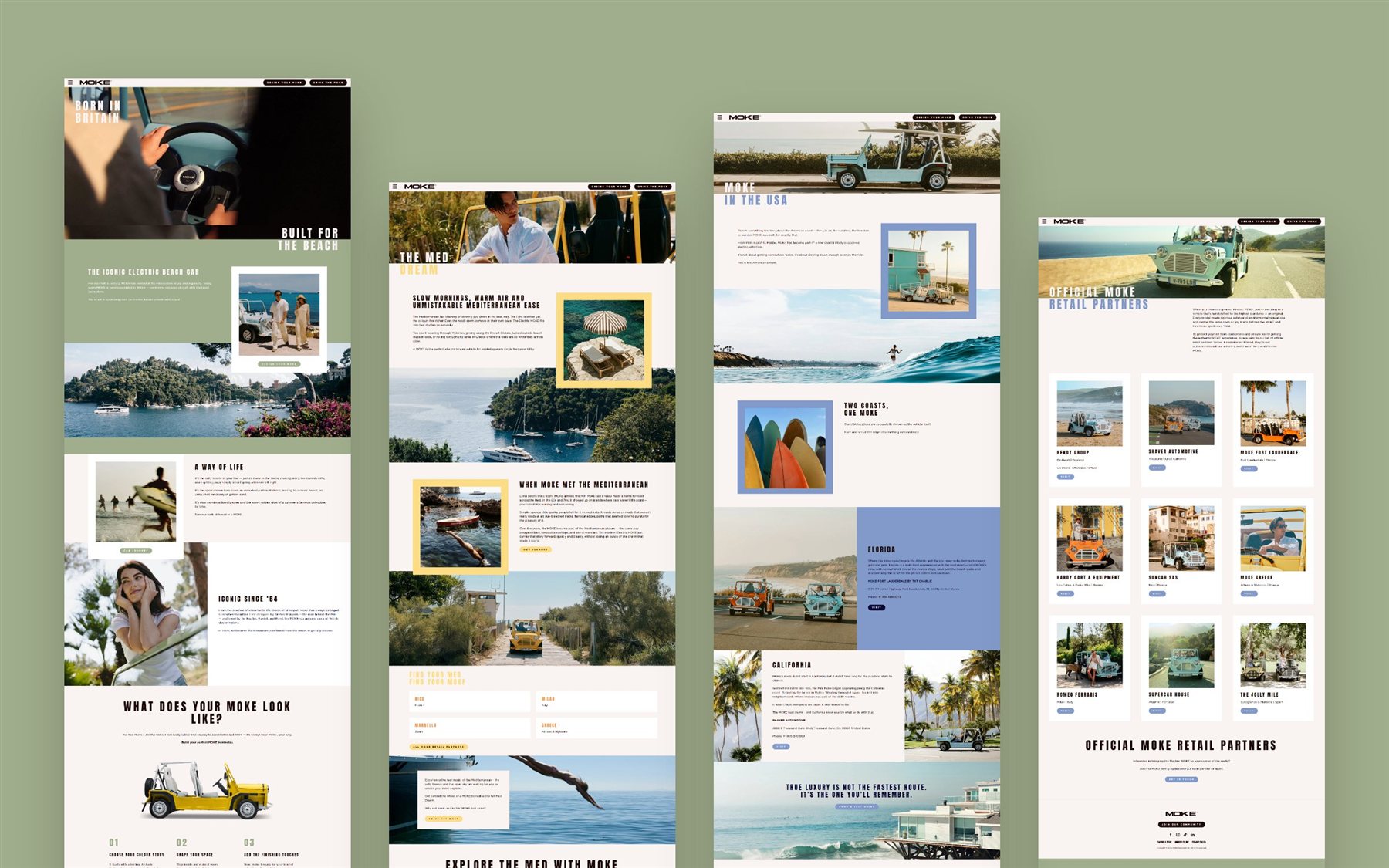
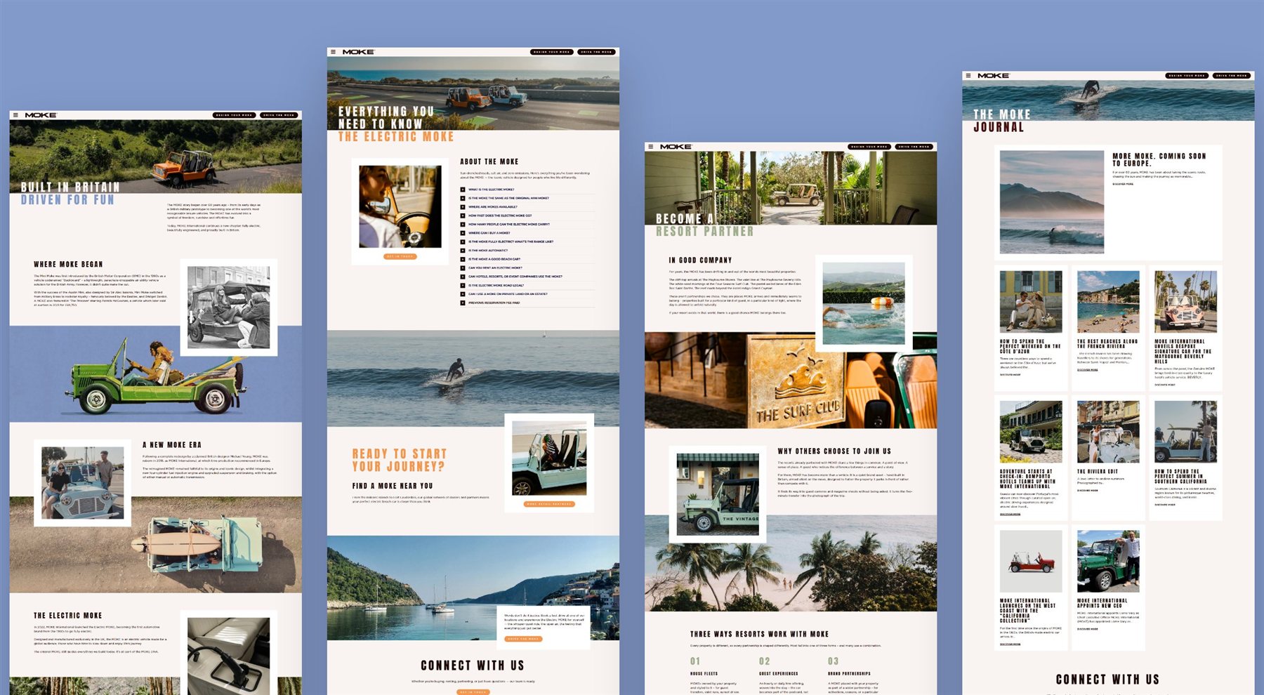
MOKE International launched the Electric MOKE but ran multiple regional websites with inconsistent visual identities. The fragmented brand presence was diluting premium positioning and putting pre-order momentum at risk.
The Approach
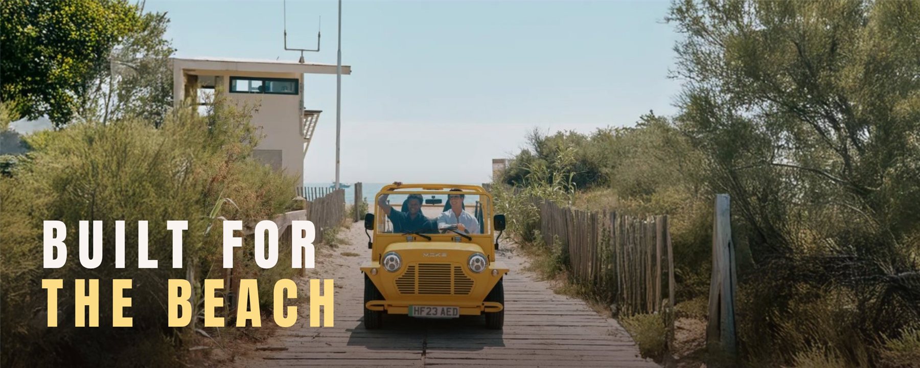
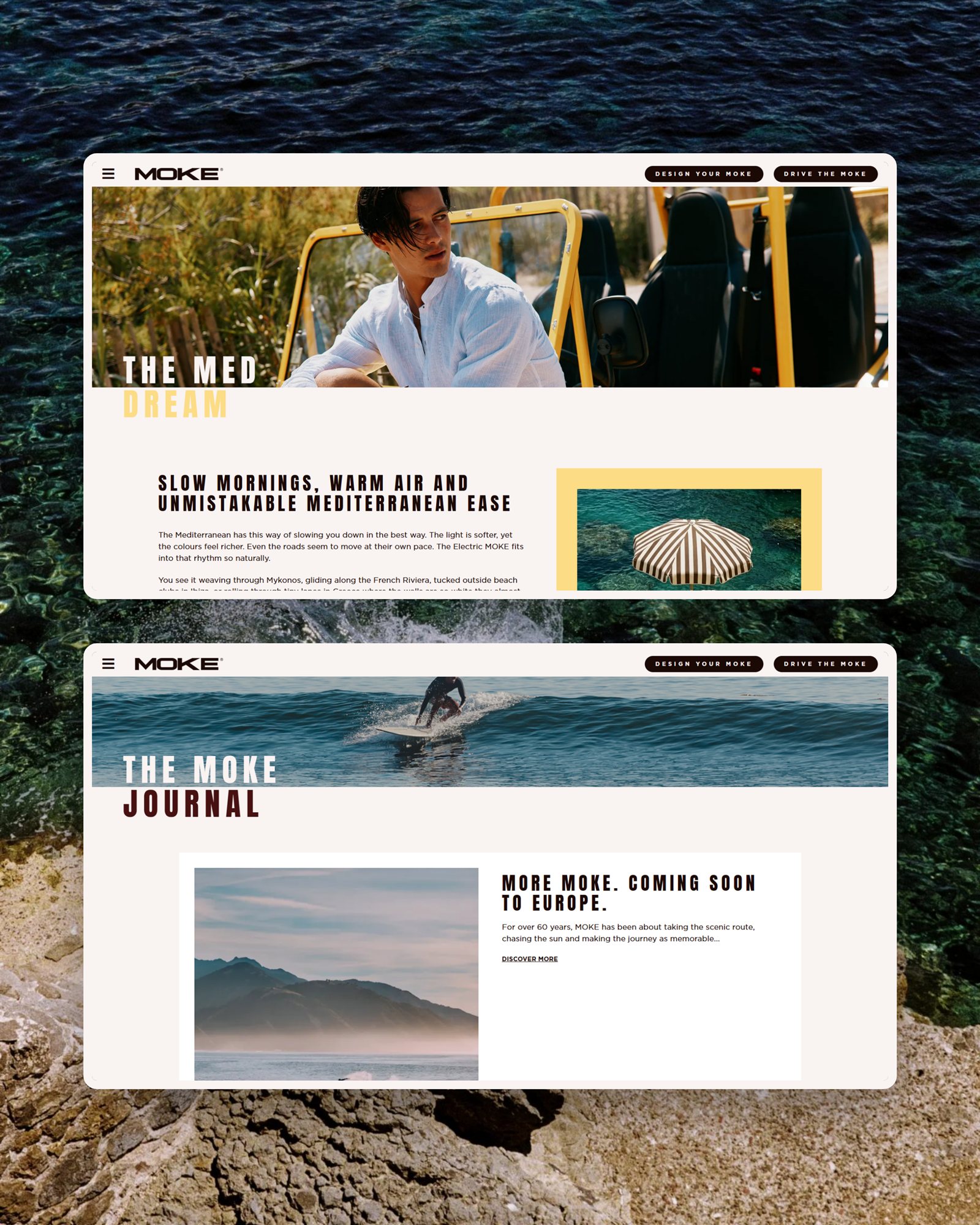
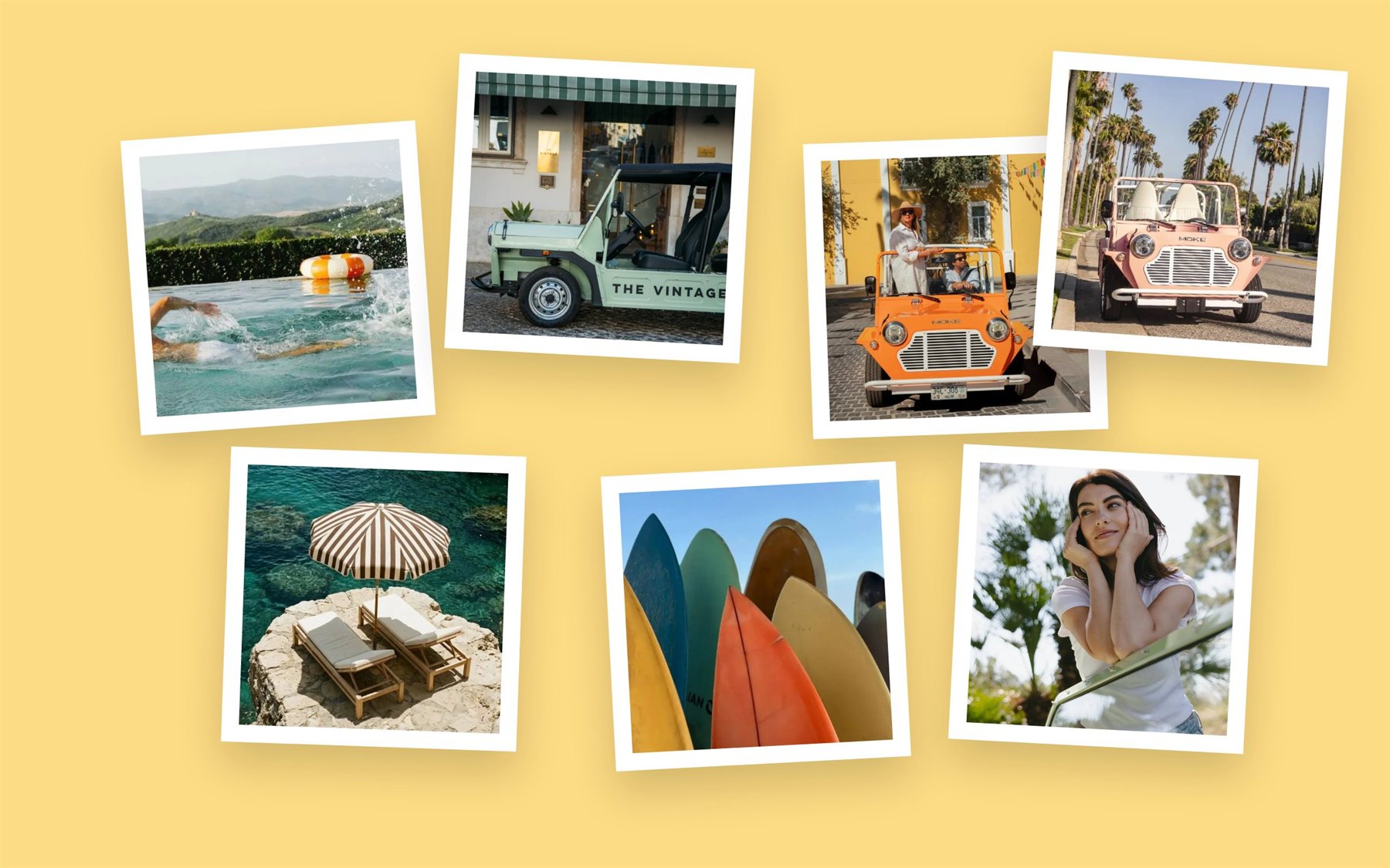
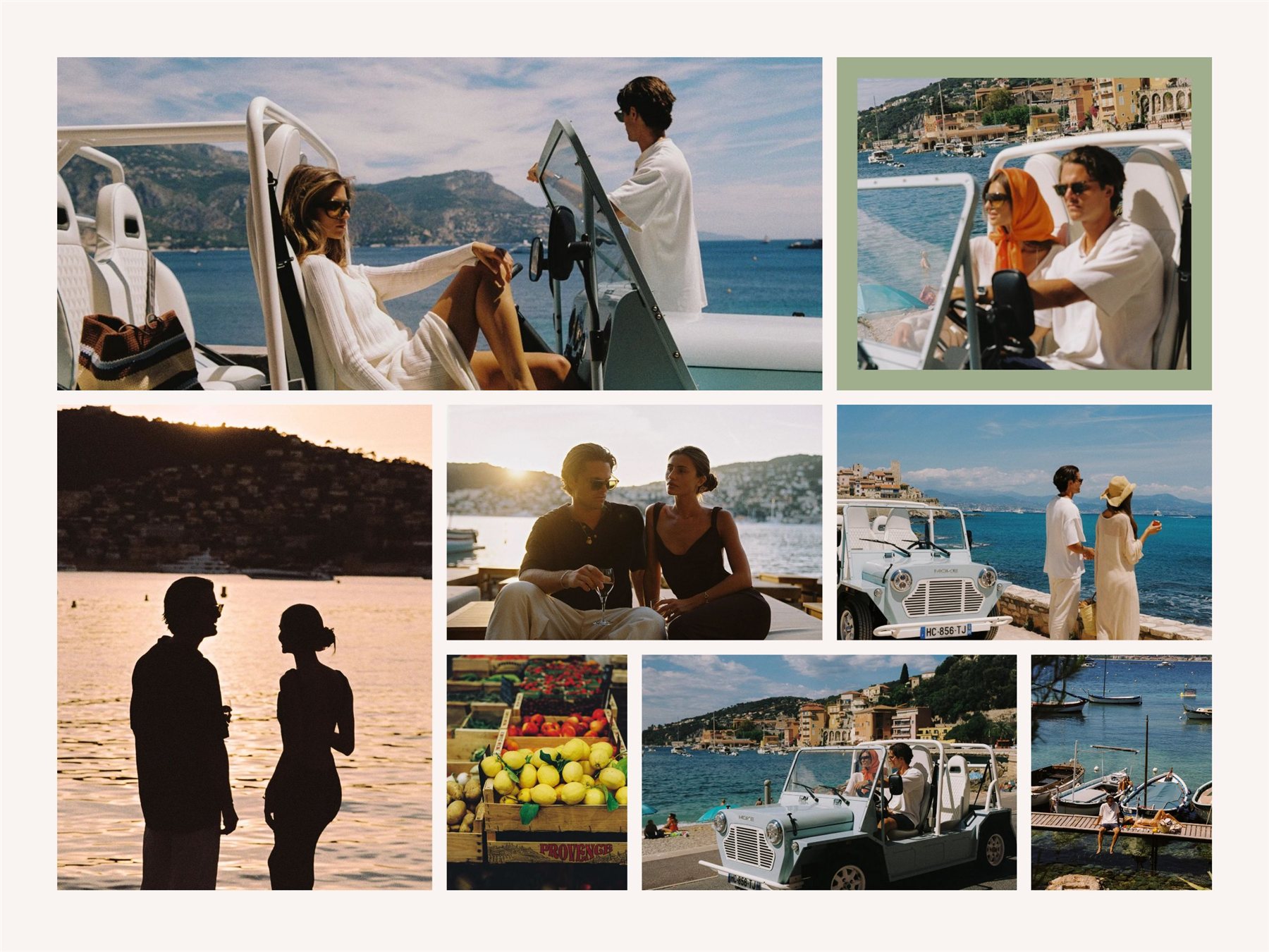
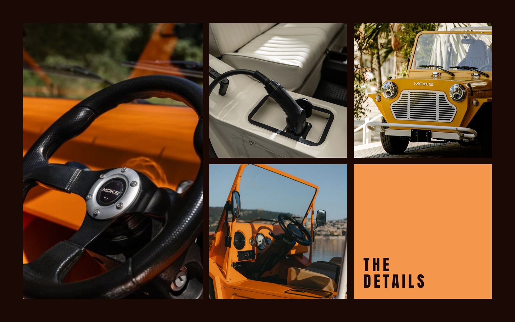
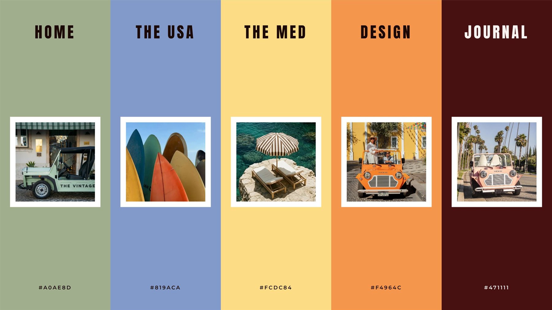
Rooted the design in the Electric MOKE's core identity: open air freedom, coastal living, effortless exploration. Built an editorial colour palette, aspirational typography, and a layout structure that let lifestyle photography carry the emotional weight before a single spec was read.
Key Decisions
Unified all regional touchpoints under one consistent visual system, eliminating brand fragmentation. Structured the user journey around discover, understand, configure, and pre-order to reduce friction at checkout. Designed a responsive system that performs consistently across desktop, tablet, and mobile. Delivered launch-ready in time to support campaign traffic and pre-order activity from day one.