The Challenge
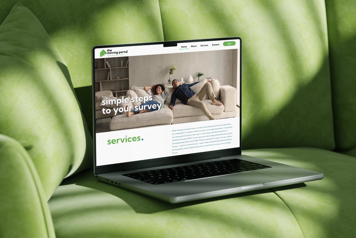
The Moving Portal was starting completely from scratch, with no logo, no visual identity, no website. In a competitive property market, they needed to look credible and trustworthy from day one, with no existing brand equity to lean on.
The Approach
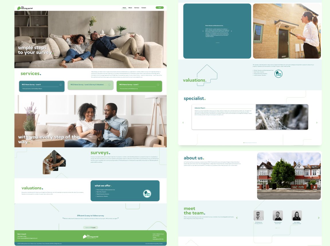
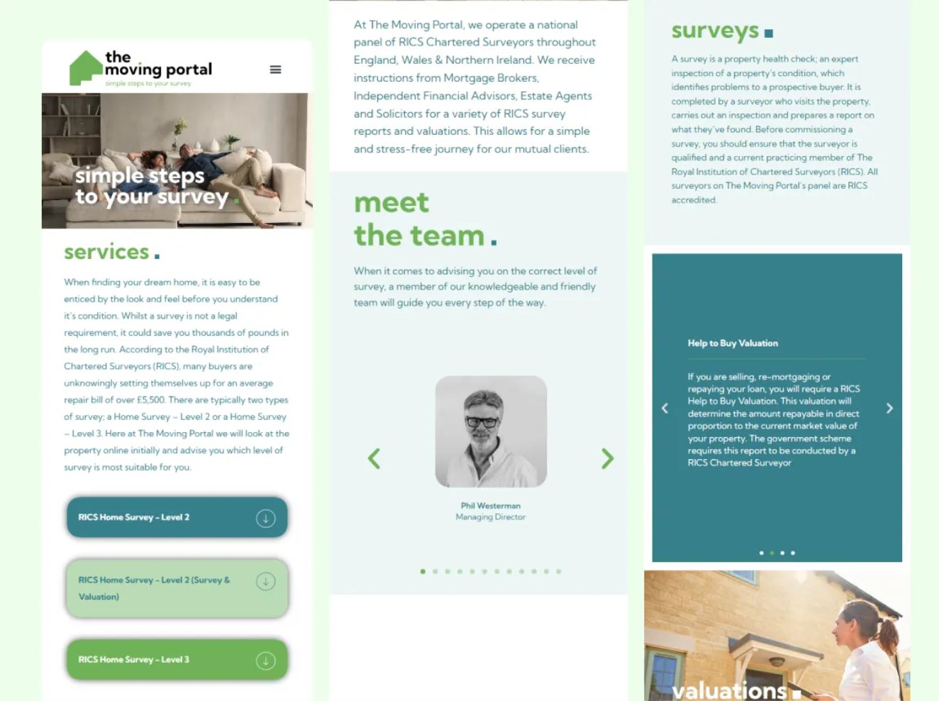
Built the brand around three values: professionalism, clarity, and approachability. Since property buyers are making major financial decisions, the identity needed to feel confident and reassuring without turning cold or corporate. Structured the website as a clear narrative, what is this, how does it work, why trust it, how do I start, so every section answers the question a visitor is actually asking at that point.
Key Decisions
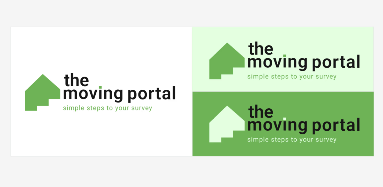
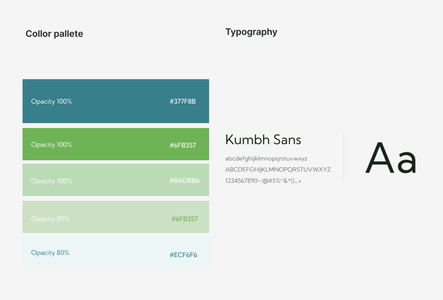
Designed the logo to work across every context, from a website header to a business card to a digital document. Chose a clean green palette to signal trust and forward movement, paired with a typography system built for readability across all touchpoints. Documented a complete brand system including colour, type, logo variations, and spacing so it scales consistently as the business grows. Structured the site to guide visitors from awareness straight through to enquiry, keeping the next step obvious at every stage.